News
Tactile Textures & Mixed Media: Adding Depth in 2D Design
In a world saturated with slick vector graphics, flat interfaces and endless scrollable feeds, there is a growing hunger for physicality — for work that looks and feels like it could be touched. Tactile textures and mixed-media approaches in two-dimensional design answer that desire. By introducing surface, depth and material suggestion into 2D work, designers can create pieces that feel layered, lived-in and emotionally resonant. Whether you’re designing posters, packaging, web hero images, editorial spreads or social posts, tactile techniques help you cut through the visual noise and build richer, more memorable communication.
This long-form exploration covers the why, the how and the what next of tactile textures and mixed media in 2D design. You’ll find psychological reasoning, practical workflows, tool choices, material experiments, accessibility and performance considerations, sustainability pointers and examples from contemporary practice. I’ll also include a couple of UK statistics so you can place the trend in context with British creative industry and audience behaviour. All advice uses British English.
Why Tactile and Mixed Media Matter Now
The cultural context
For a decade the design world celebrated minimalism and digital uniformity — clean grids, white space, neutral palettes and system fonts. That aesthetic solved many problems: legibility, speed, scalability and reproducibility. But it also made much visual communication feel generic. As audiences grow visually fluent and attention becomes scarcer, designers must find fresh ways to create emotional hooks. Tactile textures and mixed media offer that hook: they suggest craft, human touch and authenticity.
Two relevant UK facts: the creative industries contribute substantially to the national economy — the creative industries generated around £124.6 billion of gross value added in 2022, illustrating the scale and cultural importance of design and allied fields. (gov.uk) And because so much work is consumed online, reach matters: internet access in Great Britain is now near universal, with the majority of households and adults regularly online, making digital presentation and performance considerations essential when bringing tactile work to screens. (ONS: Internet access – households and individuals). (ons.gov.uk)
Psychological pull of texture
Texture cues trigger sensory imagination. When a poster looks like torn linen, a viewer’s brain fills in the feeling of touch. That sensory suggestion increases engagement and memorability. Neuroscience shows that multisensory cues — even implied ones — boost recall and emotional response. In design terms, texture can:
- add perceived value (materials feel premium),
- create hierarchy (foreground textures vs background washes),
- foster authenticity (handmade textures feel human), and
- create atmosphere (grain for nostalgia, roughness for grit, sheen for luxury).
Commercial value
Brands use tactile cues to differentiate. In packaging, a tactile finish or embossed pattern can justify premium pricing; in editorial, paper stock and printed texture communicate care. Online, photorealistic textures signal product detail and authenticity in e-commerce listings. For the UK’s strong creative and retail sectors, investing in tactile aesthetics can directly influence purchasing and loyalty (creative industries value cited above).
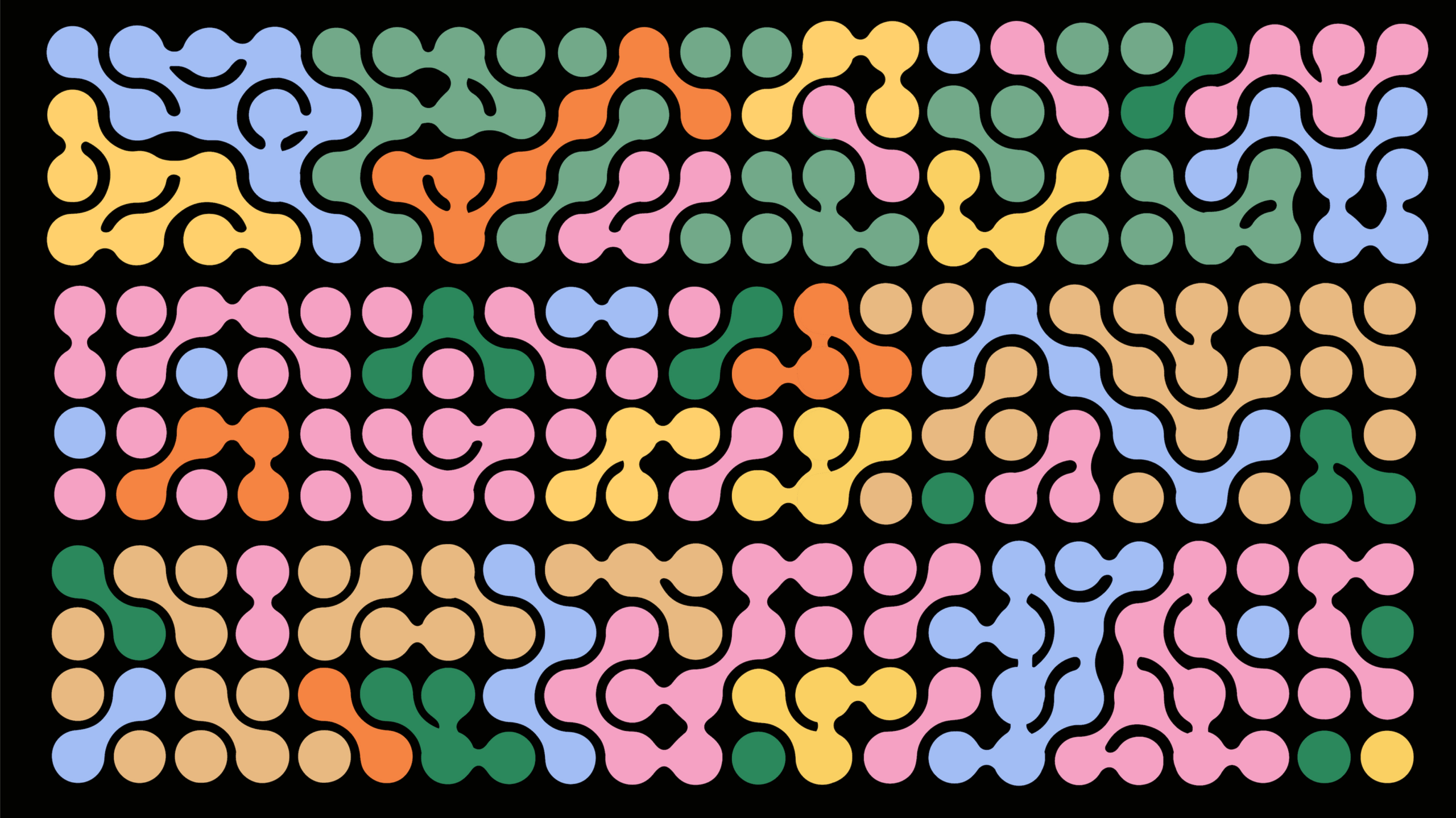
What Counts as ‘Tactile’ in 2D Design?
Tactile design in two dimensions doesn’t require the viewer to actually touch the piece — it creates the illusion of touch. Common tactile strategies include:
- Paper and print imitations: visible grain, deckle edges, fibre flecks, and subtle emboss/letterpress simulations.
- Brush and mark-making textures: painterly strokes, ink blotches, gouache, dry brush sweeps and irregular outlines.
- Photographic materials & scans: scanned collage, crumpled paper, fabric swatches, thread and stitched elements.
- Noise and film grain: subtle grain to break digital perfection and suggest analogue warmth.
- Surface effects: varnish, watermarks, ink bleed, bleed edges and water stains.
- Layered montages: layered scanned paper, translucent overlays, tape marks and staples.
- Mixed typographic treatments: type set on textures, type printed on photographed materials, type that looks hand-drawn.
- 3D photoreal textures used in 2D: photographed clay, plaster, wood or metal surfaces included as backdrops or masks.
All of these techniques suggest tactility while staying within a 2D composition.
Core Principles for Using Texture and Mixed Media
Before jumping into processes, anchor your practice with a few principles to keep texture purposeful rather than gratuitous.
- Purpose over ornament Texture should support message, mood or function. Is the texture adding perceived quality? Is it clarifying a brand trait? If it’s purely decorative, reassess.
- Hierarchy and restraint A textured piece should still have a clear visual hierarchy. Use texture to frame, to support focal points or to create depth — avoid texturing everything equally.
- Contrast & legibility When placing text over texture, ensure legibility with contrast, overlays or clear type blocks. Bold, noisy textures need breathing room.
- Scale and scale-consistency Textures imply scale. Large fabric weave overlaid at tiny scale can look like a pattern; at large scale it reads as weave texture. Choose scales that match the intended real-world material impression.
- Balance analogue and digital Authenticity often comes from analogue origins (scans, photographs, hand drawings). Combine these with clean digital vector forms carefully; the contrast is what makes the texture sing.
- Performance & delivery constraints For digital work, heavy, high-resolution texture files can slow delivery. Optimise for web (compress, use modern formats, lazy-load). For print, provide high-res sources and separate spot effects as needed.
- Accessibility and inclusivity Textured backgrounds can impede readability for people with vision impairment. Provide high contrast alternatives, ensure sufficient type contrast ratios, and avoid conveying information only via texture.
Tools and Techniques: Analog, Hybrid and Digital Workflows
Below are practical, field-tested techniques designers use to create tactile 2D work. I’ll cover analogue methods you can implement in a studio, hybrid methods that combine scanning and photography with digital tools, and purely digital approaches that mimic analogue textures convincingly.
Analogue first: Materials to gather and methods to try
If you want authentic texture, gather real materials. Here are starter items and simple techniques:
Materials
- Various paper stocks: textured cotton rag, recycled paper with flecks, newsprint, Japanese washi, deckle edges.
- Paints: gouache, acrylic (matte and heavy body), watercolour.
- Inks: india ink, acrylic ink, alcohol ink.
- Brushes & mark-making tools: hog hair brush, sponge, palette knife, toothbrush for splatter.
- Fabric: linen, canvas, hessian (burlap) for coarse weave.
- Found objects: corrugation, sandpaper, old tickets, stamps, tape, staples and thread.
- Clay or plaster for casting small relief textures.
- Camera or scanner (high resolution).
Simple techniques
- Brush sweep: Load a wide brush with diluted gouache and sweep across paper for soft streaks. Scan at 600–1200 dpi.
- Dry-brush: Use almost dry pigment on rough paper for scratchy textures.
- Splatter and spatter: Flick paint with a toothbrush for fine grain; use larger brushes for heavier spatters.
- Rubbing/ frottage: Place paper over textured object (e.g. wood grain, metal) and rub charcoal or pencil to capture texture.
- Crumple & uncrumple: Crumple paper, smooth out and scan. It reads as aged, tactile paper.
- Stitching & thread: Sew thread into paper or fabric, photograph close up for stitch texture.
- Tape and residue: Stick tape onto paper, peel and scan marks left for adhesive sweet spots and torn fibres.
Scanning tips
- Scan at high resolution (600–1200 dpi) for maximum flexibility.
- Use flatbed scanner for paper items; a DSLR/studio lighting for 3D objects.
- Capture both texture and shadow — side lighting emphasises surface relief.
- Photograph textures with a macro lens if you need large, seamless repeats.
Hybrid workflows: Scan + build in software
Most textured design today uses hybrid workflows: create tactile elements in the studio, digitise them, and combine in Adobe Photoshop/Illustrator, Affinity Photo/Designer, Procreate or even Figma. Here’s a typical process:
- Create analogue assets: mark-making, painted washes, torn paper edges, stitched pieces.
- Digitise: scan or photograph — capture at high resolution and consistent colour profile (use a grey card if colour fidelity matters).
- Clean and isolate: in Photoshop, remove background using levels/curves, select/lighten/colour range to isolate textures (or preserve edges for collages).
- Make textures repeatable (if needed): use Photoshop’s Offset filter and clone/patch seams.
- Construct composition: combine scans as layers, adjust blend modes (Multiply, Overlay, Soft Light) to integrate textures with shapes.
- Add depth: use drop shadows, ambient occlusion brushes and gradient maps to unify tonal ranges.
- Finalise colour: apply global colour grading — gradient maps, selective colour adjustments and subtle duotones can bring the tactile assets into a cohesive palette.
Digital-native methods: creating tactile feel without studio
It’s entirely possible to create convincing tactile textures inside software if you don’t have a studio. Modern tools include:
- Photoshop brushes: dozens of brush packs mimic charcoal, gouache, pastel and fabric textures. Use scatter, texture and dual brush options to emulate irregular marks.
- Procreate: excellent for simulated textures and hand mark-making on iPad with various pressure and tilt responses.
- Subtle 3D tools: Blender, Cinema 4D or Substance can generate photoreal textures, bump maps and displacement which you can render flat for inclusion in 2D layouts.
- Noise and film grain: adding layered noise at low opacity gives a tangible, analogue feel.
- Pattern generators: create organic halftones, irregular patterns and edge maps to simulate scuffs, grain and screen printing imperfections.
- Lottie/JSON for web: animate texture reveal or parallax effects with lightweight vector-based files.
Digital technique example (Photoshop):
- Create base colour block.
- Add a “paper grain” layer: Fill with 50% grey, add Noise + Gaussian Blur, set to Overlay at low opacity.
- Add an ink blot layer: brush with textured brush, set to Multiply to sink into paper tone.
- Add edges: use torn edge PNGs with alpha masks to frame sections.
- Colour grade: Curves + Gradient Map for cohesive tonality.
Combining vectors with texture
Combining crisp vectors with soft texture is key to modern mixed-media design. Use textures as masks or overlays rather than backgrounds only. Example techniques:
- Clipping masks: place a texture layer clipped to type or shape to create tactile typography.
- Vector masks and halftone masks: apply vector shapes as masks over texture layers to produce cut-paper effects.
- Blend modes: use Overlay for colour interaction, Multiply for ink effects, Screen for lighter textures.
Working for Print vs Digital: Different constraints, different freedoms
Print considerations
Print allows true tactility (emboss, letterpress, varnish, textured stocks). When your final piece will be printed, photographs and scans should be high resolution (300 dpi or above), and you must think about:
- Paper stock selection: uncoated vs coated, cotton rag, laid, textured, recycled with fibre flecks — the choice alters how texture reads.
- Special finishes: embossing, debossing, foils, UV varnish, soft touch lamination, letterpress — each creates a tangible surface impression.
- Colour spaces: work in CMYK (or spot colours in Pantone) and soft proof on device.
- Bleed and trapping: textured edges might require extra bleed if texture reaches document edge.
- Registration: when layering inks for faux texture, avoid extremely tight registration demands if printing on letterpress.
Practical tip: provide printers with flattened, high-res TIFFs or PDFs with clearly specified spot varnish/foil layers as separate files.
Digital considerations
On screens, tactile textures are optical illusions; performance, accessibility and responsive behaviour matter.
- File sizes: use compressed modern formats (WebP, AVIF) and appropriately sized images for responsive breakpoints. Serve smaller images to mobile users.
- Retina screens: supply @2x images for crispness.
- Performance: lazy-load non-critical textures, and use CSS for simple effects where possible.
- Accessibility: if texture carries meaning, provide a textual equivalent for assistive tech. Ensure any text over texture meets WCAG contrast guidelines.
Texture as Storytelling: How Material Conveys Meaning
Different textures carry different associations. Use them as semiotic tools.
- Paper & deckle edges → craft, heritage, authenticity, nostalgia. Ideal for artisanal brands and cultural editorial.
- Canvas & linen → fine art, painterly quality, hand-made processes; evokes galleries and ateliers.
- Rustic wood / grain → natural, sustainable, earthy, outdoors; suitable for food, furniture and eco brands.
- Polished metal / foil → luxury, prestige, high price point; used in cosmetics, jewellery packaging.
- Gravel / concrete → urban grit, industrial design, contemporary architecture.
- Film grain & colour bleed → retro, cinematic, analogue nostalgia; good for music and fashion.
Think beyond the obvious: texture can also imply process. For instance, screen-printing halftone edges implies small-run production; visible brush marks imply authorial touch.
Case Studies & Examples (Practical Inspiration)
Below are hypothetical and practical examples — you can replicate the approaches as exercises.
1. Editorial Magazine Spread — “Issue on Memory”
Goal: evoke nostalgia and tactility. Approach: combine scanned yellowed paper, a torn photograph edge, hand-written marginalia scanned at high res, and a subtle film grain overlay. Use warm duotone gradient mapping to unify colour. For print, choose an uncoated cream stock; for web, present as a scrollable feature with subtle parallax on the scanned photo to suggest depth.
2. Limited Edition Packaging — Artisan Chocolate
Goal: premium craft impression. Approach: use deckle-edge paper wrap (photographed), a wood-grain inner tray pattern, embossed logo (simulate emboss in mockups), and letterpress typography. Provide the printer a mock up with spot varnish layer for logo. Photographs on the website show macro details of the paper and emboss.
3. Social Campaign — Independent Musician
Goal: vivid, tactile, and youthful. Approach: collage of scanned cassette tape textures, scrawled lyric snippets, bright gouache swatches and neon halftones. For motion, animate a paper flip effect and a grainy VHS line using Lottie or compressed MP4 for social platforms.
4. Website Hero — Boutique Hotel
Goal: tactile warmth for brand site. Approach: hero uses a large, desaturated linen texture behind elegant serif type; on hover the texture subtly shifts with parallax to suggest physical fabric. Use compressed WebP background and provide a low-quality placeholder for faster initial paint.
Practical Step-By-Step: Create a Tactile Poster (Project)
Here’s a full step sequence you can follow to create a tactile poster that translates well for both print and web.
Materials: gouache wash, torn paper, sandpaper, black ink, scanner/DSLR.
- Create base textures: Paint two or three washes of complementary colour on textured paper. Make ink splatters and tear smaller papers for collage. Rub sandpaper to create scuff marks.
- Photograph/scan: Digitise at 600 dpi (scans) or shoot on a tripod with side lighting for shadows.
- Clean assets: In Photoshop, desaturate a working copy for tonal matching. Isolate edges using levels and remove any dust via patch tool.
- Build composition: In a new canvas (CMYK for print, RGB for web), layout your headline area with a bold type. Clip a paper texture to the letterform (using mask) and adjust to Multiply to look like inked type on paper.
- Add depth: Add a subtle drop shadow for lifted collage pieces using multiply layer and large gaussian blur; create ambient occlusion by painting low-opacity black along meeting edges.
- Colour grade: Apply Curves and a Gradient Map to unify tonal range; add slight grain on top layer at 3–5% opacity.
- Prepare outputs: For print, export 300 dpi PDF/X with spot varnish separations if needed; for web, export hero JPEG/WebP at 72–150 dpi optimised for breakpoints.
Accessibility, Usability & Ethical Considerations
Tactile textures can add significant value, but they must be used responsibly.
Accessibility
- Contrast: ensure text over texture meets WCAG contrast ratio (4.5:1 for body text). Add background overlays (solid or translucent) behind text where necessary.
- Alternative content: where texture conveys meaning (e.g. worn label = vintage collection), include alt text or visible cues so screen reader users grasp the context.
- Motion sensitivity: for animated textures, provide reduced-motion alternatives via CSS prefers-reduced-motion.
Usability
- Clarity before flourish: never sacrifice the function for aesthetics. Navigation, calls to action and critical information must be clear.
- Responsive behaviour: test how textures behave across devices — tiny textures can become noisier at small sizes; scale or swap asset variants accordingly.
Ethics & authenticity
- Cultural sensitivity: be mindful of patterns, marks or motifs with cultural significance; avoid appropriation and credit sources where relevant.
- Transparency with generative tools: if you use AI to produce textures (e.g. generative brushes or AI texture synthesis), consider being transparent about its role in the creative process, especially for commissioned bespoke work.
Sustainability and Material Choices
Tactile aesthetics often draw from craft and materials. If you plan to translate a digital design to physical print or packaging, think about environmental impact.
- Paper sourcing: choose FSC-certified stocks, recycled papers or tree-free options (like cotton rag). Recycled stocks often have pleasing flecks that support tactile aesthetics naturally.
- Printing processes: letterpress and foil can add tactile quality but can be resource-intensive. Use local, certified printers and consider digital emboss effects if budget or sustainability are concerns.
- Minimal waste: plan print runs carefully and create mockups digitally (or with small sample runs) to avoid overproduction.
- Longevity vs disposability: tactile objects that last (keepsakes, limited runs) can be more sustainable than mass disposable printed editions.
The UK craft and design sectors are aware of heritage skills and environmental responsibility; supporting local makers and sustainable printers helps preserve craft skills and reduces supply chain impacts. (See Heritage Crafts & Design Council resources, and craft market studies.) (craftscouncil.org.uk, designcouncil.org.uk)
Presenting Texture-Rich Work: Portfolios and Mockups
When showing tactile work online, presentation matters.
- Macro details: include close-up photos that show surface and grain. These build trust for physical products.
- Contextual lifestyle shots: photograph textured packaging in hands or on surfaces to convey scale and tactility.
- Interactive previews: for websites, small parallax or hover reveals let viewers perceive depth without heavy files.
- Mockup fidelity: use mockups to simulate emboss, varnish and spot effects; for high-end client delivery, supply physical proofs.
Teaching & Learning: Exercises to Improve Your Tactile Sense
Try these studio exercises to build a tactile vocabulary:
- Texture scavenger hunt: over a week, photograph 50 textures around you (walls, fabric, food, nature). Build a texture library.
- One-material exploration: create 20 marks from one material (e.g. charcoal) on different paper stocks; notice how substrate changes the mark.
- Limited palette collage: build five small collages using only torn paper and two colours. Focus on composition and tactile juxtaposition.
- Scan + vector mask: scan a wrinkle and use it as a clipping mask for a geometric vector logo — explore contrast between clean and rough.
Trends & The Future: Where Tactile Design Is Going
Several currents suggest tactile, mixed media styles will keep thriving:
- Hybrid craft/digital studios: designers with hand skills are in demand to supply authentic tactile assets for digital campaigns.
- Generative texture tooling: AI and generative tools will make new textural possibilities (e.g. physically based procedural textures), but trained designers will be needed to curate and humanise results.
- AR & haptic integration: as AR and haptics mature, tactile aesthetics in 2D may feed into multisensory experiences (simulated textures, haptic feedback in apps).
- Localised maximalism & craft revivals: communities valuing heritage craft skills will push for tactile authenticity — reported in UK craft research and cultural preservation conversations. (craftscouncil.org.uk)
Final Checklist: Designing with Texture (Handy Reference)
Before finalising a piece with tactile elements, run through this checklist:
- Purpose: Does the texture support the message?
- Hierarchy: Is the focal point clear?
- Legibility: Can all users read the important text?
- Scale: Are textures at appropriate visual scale?
- Performance: Are files optimised for the delivery medium?
- Accessibility: Have you provided alternatives and high-contrast options?
- Sustainability: Are physical materials responsibly sourced?
- Proofing: Have you tested printed proofs and screen variants?
Conclusion
Tactile textures and mixed media enrich two-dimensional design by reintroducing materiality, warmth and human touch. They are a powerful antidote to visual homogeneity and an effective way to communicate craft, authenticity and emotional tone. Whether you work in print, editorial, branding or digital, the key is to use texture with intention: let it amplify the message, create hierarchy and invite curiosity — not simply act as decoration.
As the UK’s creative ecosystem continues to flourish and adapt — from studio makers to large creative agencies — tactile design offers an expressive vocabulary that resonates with modern audiences seeking substance and feeling in a predominantly digital age. With mindful techniques, accessible workflows and sustainable choices, designers can bring the sensory richness of mixed media into clear, functional, and beautiful 2D work.


The Ultimate Social Media Guide
With the ever-growing power of social media, we use the latest techniques, video, and animation software to craft eye-catching social media assets that make your brand pop. Our designers, wielding Adobe Creative tools, create distinctive animations and graphics to illuminate your brand story and highlight your products or services. Want a unique design? No problem – we also offer bespoke designs to match your brand aesthetic.