News
Motion & Typography: Why Animated Text Is the Future of Visual Storytelling
In a world saturated with content — from social media feeds and streaming video to mobile apps and dynamically updating websites — grabbing and keeping attention has never been more challenging. Static images and plain text are easily ignored. Increasingly, designers, brands and storytellers are turning to motion — and especially animated typography — to elevate narrative, imbue tone, and guide viewers through content in a way that feels immersive, emotional, and memorable.
This article explores why motion and typography — particularly animated or “kinetic” text — are becoming essential tools for visual storytelling. We’ll trace how they engage audiences psychologically, how they can enhance brand identity, how they function across mediums (websites, video, UI, marketing), and why they’re particularly relevant in our attention-scarce digital era. We’ll also highlight UK-relevant context and statistics where possible.
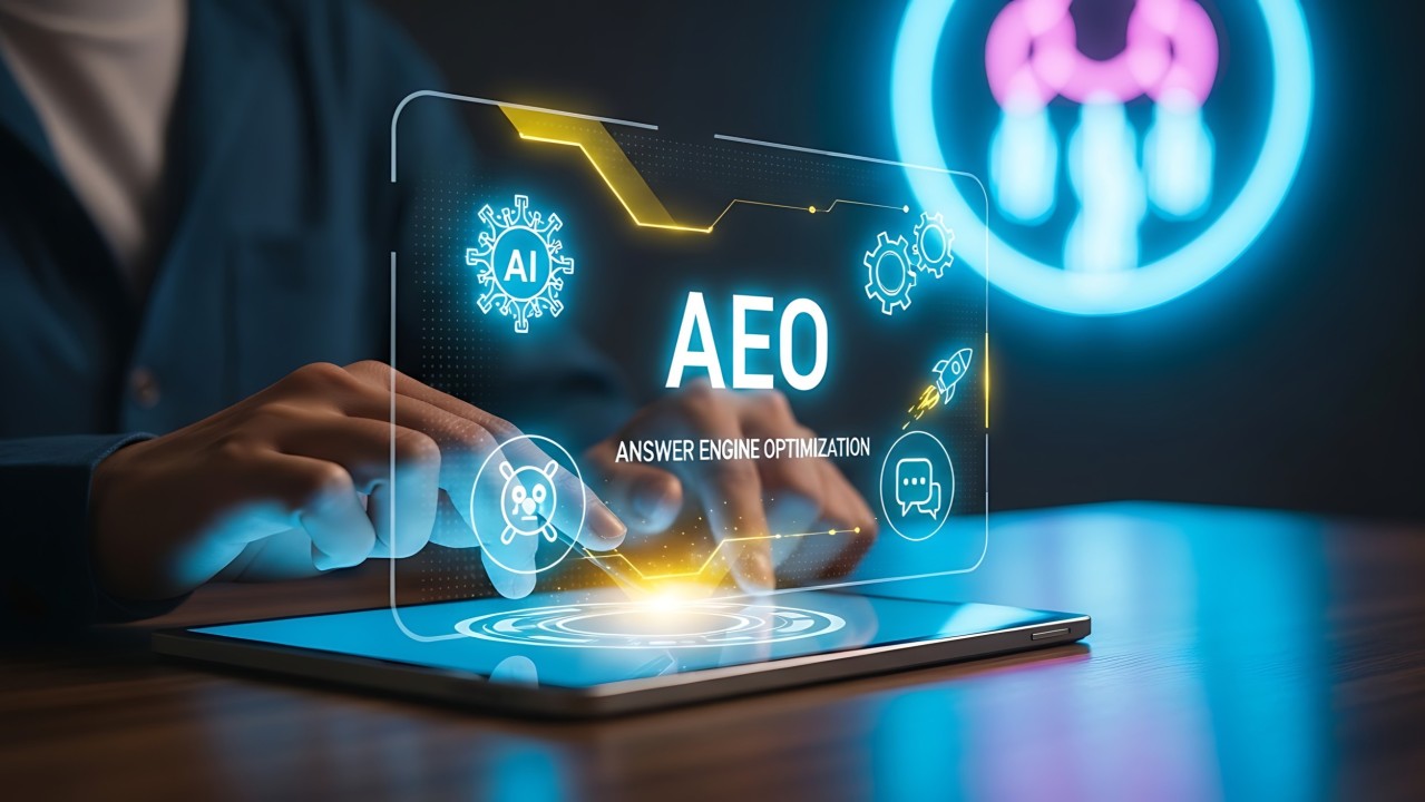
What Is Motion Typography?
Before diving into benefits and applications, let’s clarify what we mean by “motion typography.”
- Motion design broadly refers to any design discipline that incorporates movement. This can include animations, transitions, micro-interactions, motion graphics, animated icons, and more. MoldStud+2motioncrux.com+2
- Kinetic typography is the specific technique of animating text — letterforms, words, or entire blocks of copy — to move, morph, fade, scale, rotate, or otherwise animate in time. This dates back decades (even before digital) — early cinema experiments in animated titles showed the potential of “moving text” for cinematic drama. Wikipedia+2Fylenzo – Creative Design+2
- In modern digital design, kinetic typography can appear in webpages (CSS/JS animations, SVG, WebGL), in videos (animated text sequences, lyric videos, title sequences), in app UX (loading states, transitions, interactive feedback), social media, marketing assets — essentially anywhere where words meet motion. Graphicfolks+2Medium+2
In short: motion typography merges the precision of text with the emotion and movement of animation to create dynamic storytelling devices.
Why Motion & Typography Work — The Psychology of Moving Words
1. Motion Attracts Attention: Humans Are Hardwired to Notice Movement
From a survival standpoint, motion in our visual field triggers an instinctive orientation reflex: movement suggests change or significance, demanding our attention. In digital contexts, this means a subtle animated headline or a gently shifting background will naturally draw the eye more than static content. motioncrux.com+2webbb.ai+2
Because motion engages users so quickly, it becomes a powerful way to deliver a message before attention is lost — especially in our fast-scrolling social-media and mobile-driven world. Motion typography is often that “scroll-stopping” element that entices a user to pause and engage, rather than scroll past.
2. Enhanced Engagement, Retention and Memory
Motion graphics — including animated text — have been shown to substantially improve content engagement and retention. According to studies referenced by motion-graphics advocates: viewers remember up to 95 % of a message when it’s delivered via video or animation, versus about 10 % if the same content is delivered as static text alone. Magicalogical+2motioncrux.com+2
Similarly, research indicates that properly implemented motion design can reduce cognitive load for users and improve comprehension. Visual feedback, smooth transitions, and animated cues help users process information more intuitively. MoldStud+1
For brand storytelling, this means motion typography doesn’t just look good — it helps your message stick.
3. Emotional Resonance and Brand Personality Through Movement
Words carry meaning; typography carries aesthetics and voice; animation adds rhythm, tone, and emotional weight. When text moves — appears, fades, pulses, shifts, syncs with sound or visuals — it carries more emotional resonance than static text ever could. mangomedia.ie+2123internet.agency+2
For brands or creators trying to convey vibes — seriousness, playfulness, urgency, calm, drama — motion typography becomes a tool to embody those qualities. Through timing, easing, layering, rhythm and style, animated text can convey subtle or bold personality cues that static typography cannot.
Where Motion Typography is Already “Winning” — Real-World Use Cases
Motion typography isn’t a fringe design fad anymore. It’s increasingly part of how brands, designers, marketers and developers communicate — particularly when they need to stand out. Some domains where it shines:
🎬 Film, Video & Entertainment
Title sequences, credit rolls, lyric videos, trailers and opening animations: all classic uses of kinetic typography. The technique helps set the tone, create anticipation, deliver atmosphere, and frame narratives before the first frame even plays. animationcoursesahmedabad.com+2Wikipedia+2
Think of cinematic films or streaming media; animated typography before or between segments primes viewers emotionally and establishes mood quickly.
📲 Websites, Web Interfaces & UX Design
On modern websites and web apps, motion typography is popping up in:
- Hero headings that animate on load or scroll
- Micro-interactions (button hover effects, feedback text, error messages)
- Section transitions and reveal animations
- Loading or splash screens replacing blank or static loading pages Medium+2MoldStud+2
This isn’t just “flashiness”. Carefully applied motion improves usability by guiding attention, signalling interactivity, and smoothing navigation — making web experiences feel alive, coherent and intuitive. MoldStud+1
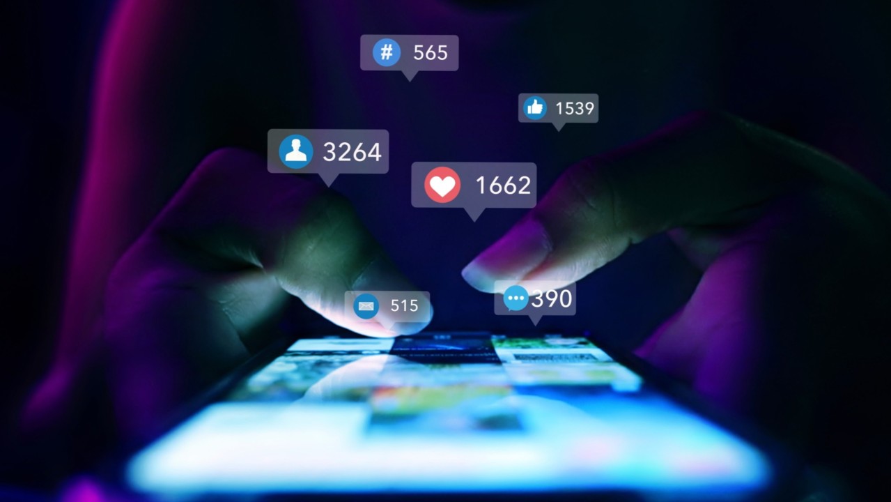
📣 Digital Marketing, Branding & Social Media
Advertorial videos, social-feed animations, digital ads, explainer clips — motion typography elevates these formats. Animated text helps distil and emphasise key points, making them more digestible and emotionally compelling for audiences that scroll fast and skim content. 123internet.agency+2realgraphix.in+2
In the UK and European advertising landscape, many brands now rely on animated campaigns to break through noise; motion typography is a key tool in the motion-graphics toolbox. Educational Voice+1
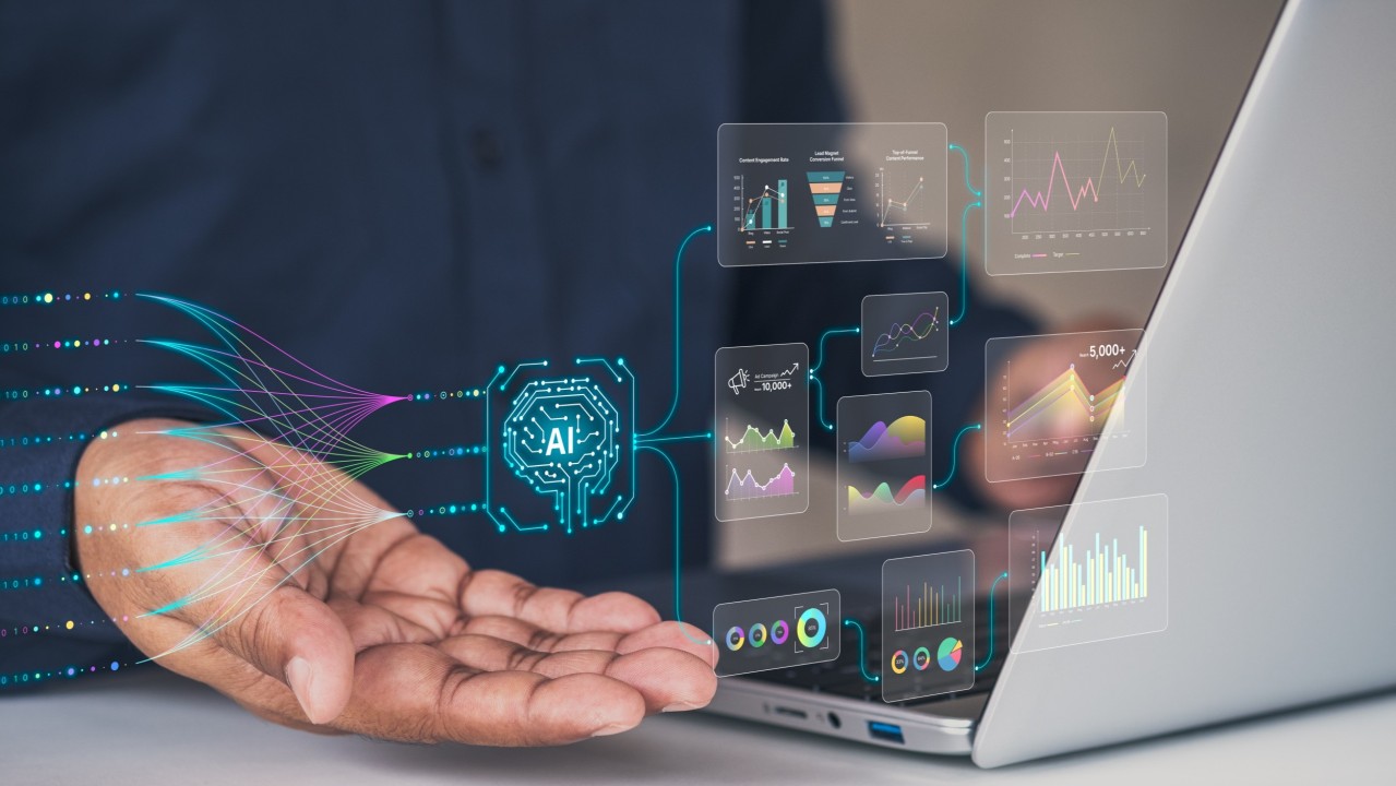
🧑💼 Corporate Communications, Presentations & Data Visualisation
Kinetic typography isn’t just for flashy consumer brands. Corporates, NGOs, and B2B organisations increasingly use animated text — annual reports, slide decks, internal videos — to present otherwise dry data or complex ideas clearly and memorably. animationcoursesahmedabad.com+2Fylenzo – Creative Design+2
For businesses wanting professional polish while communicating information effectively — motion typography can help turn monotonous content into attention-grabbing, understandable narratives.
Why the Rise Is Accelerating Now — Technology, Attention spans & Market Forces
Several converging factors make motion typography especially relevant now:
• Declining Attention Spans & Content Saturation
Consumers are inundated with content (ads, social posts, newsletters, videos). Static content is easy to ignore. Motion — especially moving text — demands attention and differentiates a message from the noise.
• Advances in Web Technology & Distribution
Modern browsers, faster internet speeds, WebGL, CSS animations, SVG, and widespread support for video/animation make it far easier to deliver motion-typography experiences without heavy performance hits or compatibility problems.
• Mobile & Multi-Platform Consumption
Users consume content across devices — phones, tablets, laptops. Motion typography adapts well to screen size, orientation changes, and offers consistent cross-platform storytelling. USP and brand consistency remain intact.
• Psychological & Marketing ROI — Better Engagement and Memory
As noted, motion improves retention and emotional resonance; from a marketing perspective this leads to higher conversions, deeper brand recall, and stronger engagement — which in turn often justifies the production cost or development effort.
The Benefits — What Motion Typography Adds Compared to Static
BenefitWhy It MattersAttention captureMovement draws the eye; kinetic typography stands out in busy social feeds or crowded websites.Improved comprehension & retentionAnimated text + visuals helps digest complex ideas and makes messages more memorable.Emotional tone, brand personalityTiming, style and movement communicate mood, identity and emotion — not just words.Flexible across mediaWorks in video, web, mobile apps, marketing — versatile storytelling tool.Enhanced UX & readability cuesAnimations can guide users, provide feedback, improve navigation flow, and help with perceived performance (e.g. using loading animations).Competitive advantageAs more brands adopt motion, doing so becomes a signal of quality or modernity — helps you stand out.
What UK Designers & Businesses Should Know — Local Context & Adoption
While global trends push motion typography, its relevance in the UK context is also clear. The digitally mature UK market, high broadband and mobile penetration, and demand for polished digital presence encourage adoption of motion and animated design.
- Animation and motion graphics have become a key part of digital marketing campaigns in the UK: many British marketing agencies now offer animated-typography services for adverts, explainer videos, and corporate communications. 123internet.agency+1
- As user expectations rise, businesses (retail, creative, tech, agencies) use motion design to signal professionalism, creativity, and innovation. Motion typography becomes part of a brand’s visual identity. 123internet.agency+1
For UK-based websites or global brands targeting UK audiences: employing motion typography can strengthen digital competitiveness and align with modern UX expectations.
But — It Needs to Be Done Well: Risks and Best Practices
Of course, motion typography isn’t a silver bullet. Poorly executed motion can frustrate users, distract them, slow down site performance, or even feel gimmicky rather than meaningful. Several research-backed caveats and guidelines help ensure motion works in your favour:
⚠️ Overuse & Visual Intensity — Where It Goes Wrong
A study exploring “visual intensity” of web elements showed that increasing visual intensity (animations, flashy graphics) increases negative user response faster than conversion benefits beyond a certain point. That means too much motion — without careful balance — can harm user experience and conversions. arXiv
In other words: motion must be purposeful, paced, and aligned with content and user intent — not just decoration.
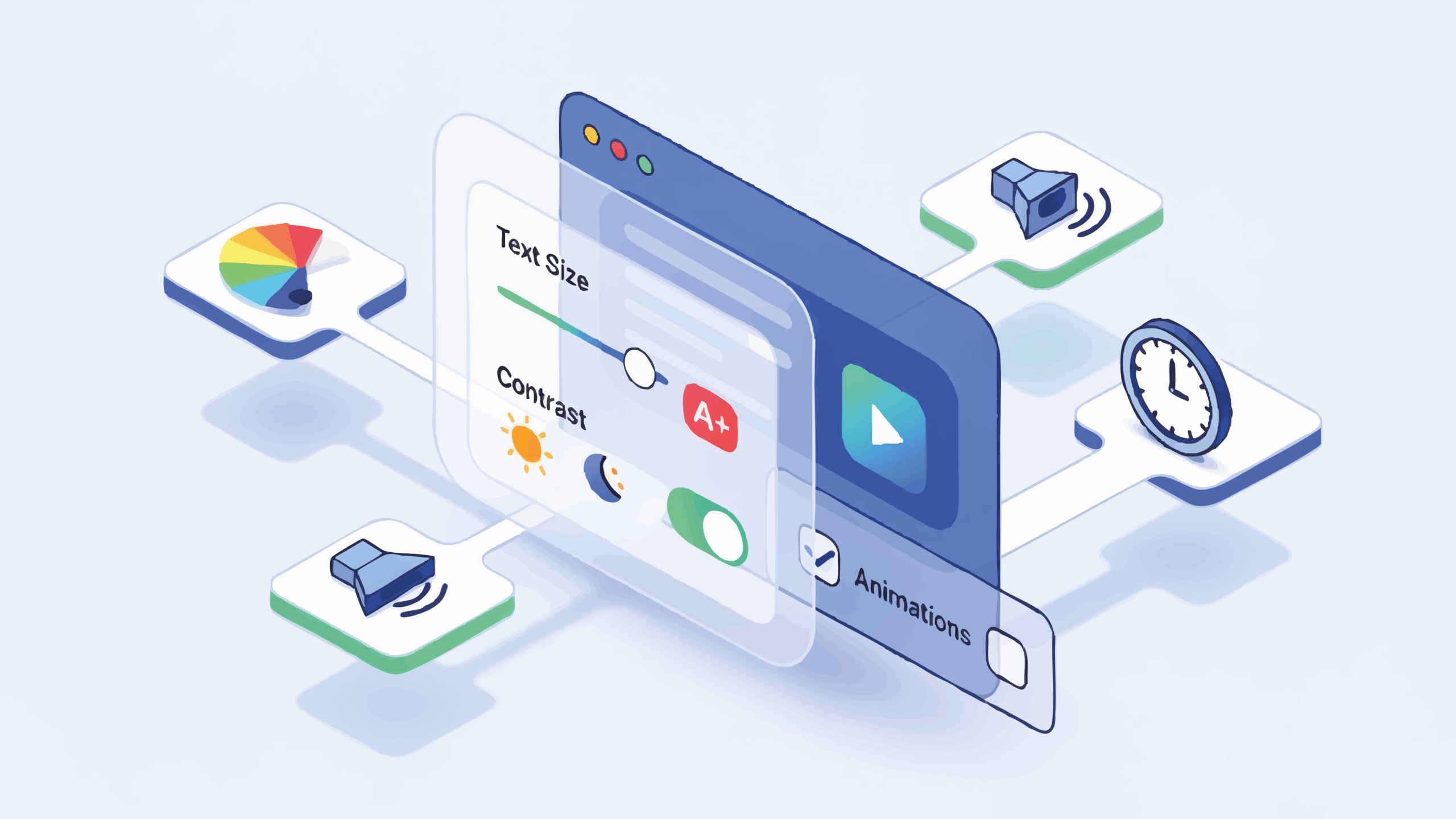
🧭 Clarity, Readability & Accessibility Matter
Animated text must remain readable. Rapid or overly stylised motion can impair comprehension. Dark-on-light contrast, sufficient display time, and optimal legibility must be preserved. Also, accessibility (e.g. for screen-reader users, or neuro-diverse audiences) should be considered: provide stops, reduce motion for people with motion-sensitivity, and ensure motion doesn’t hinder usability.
⏱️ Performance & Load Times
Animation — especially complex SVGs, WebGL, or heavy video backgrounds — can slow down load times and increase resource use. On slower connections (or older devices), this can degrade experience. It’s vital to optimise for performance, lazy-load where possible, and test across devices.
🎯 Relevance & Purpose — Match Content with Motion
Motion should support, not distract from content. Use animated typography to emphasise key points, evoke mood, guide user attention, or simplify complex information. Avoid using motion just for “flashiness.” A gradual, context-aware approach tends to yield the best UX and conversion rates. arXiv+2Medium+2
How to Start Using Motion Typography — Practical Steps for Designers & Brands
If you’re convinced by the power of motion typography — here’s how to begin integrating it effectively:
- Define Purpose & Message Before Motion
- Choose the Right Tools & Technologies
- Focus on Performance & Accessibility
- Use Motion to Guide, Not Distract
- A/B Test & Measure Impact
- Integrate into Brand & UX Strategy
The Future — Why Motion Typography Is Likely to Become Even More Important
Given current digital trends — shrinking attention spans, flood of content, mobile-first consumption, increasing demand for immersive experiences — motion typography is poised to grow in relevance. Here’s why:
- Rising demand for dynamic, multimedia content — as brands attempt to stand out in saturated markets, motion typography offers a high-impact yet often cost-effective way to elevate storytelling.
- Improved technical capabilities across devices — better browser support, faster devices, vector animations mean motion typography is more accessible than ever.
- Blurring lines between design, video, and user interface — design is no longer static or separate; motion is becoming a common ground between branding, UX and content.
- Growing value on emotional engagement and brand storytelling — consumers respond to stories, not just products; motion typography is a tool tailored for that.
- Integration with immersive and interactive media — WebGL-powered websites, interactive 3D, VR/AR experiences — animated text will remain a key layer.
For designers, marketers and brands, this suggests that investing in motion typography isn’t just a trend — it’s a forward-looking strategy to stay relevant, engaging and competitive.
Conclusion
Motion and typography together — especially animated text — form a compelling future for visual storytelling. By combining the clarity and flexibility of text with the emotional power and attention-grabbing force of motion, kinetic typography offers a way to stand out in digital noise, convey complex or emotional messages with impact, and build deeper connections with audiences.
That said — it must be used judiciously. The magic lies in intention: when motion is purposeful, purposeful in tone, message and performance. When kinetic typography is integrated thoughtfully — whether in a website hero, a social video, an interactive presentation or a UI transition — it can elevate storytelling from static statements to dynamic experiences.
As the digital world continues to evolve, with shrinking attention spans and ever-growing content saturation, animated typography stands out not just as a trend, but as a refined tool for clarity, memory, emotion and brand identity. For anyone serious about visual storytelling — now is the time to embrace motion, not as decoration — but as narrative.


The Ultimate Social Media Guide
With the ever-growing power of social media, we use the latest techniques, video, and animation software to craft eye-catching social media assets that make your brand pop. Our designers, wielding Adobe Creative tools, create distinctive animations and graphics to illuminate your brand story and highlight your products or services. Want a unique design? No problem – we also offer bespoke designs to match your brand aesthetic.