News
Your Website Is Not a Brochure: Designing for Decisions, Not Decoration
Why UX, structure, and clarity matter more than aesthetics alone
For many businesses, the website is still treated like a digital brochure. It exists to “look professional”, list services, share credentials, and tick a box that says we have a website. Design decisions are often driven by aesthetics — colours, imagery, animations, and layouts chosen because they look impressive rather than because they serve a purpose.
This mindset is one of the biggest reasons websites fail to perform.
In 2026, your website is not a brochure. It is not a static representation of your business. It is an active decision-making environment — one that shapes how visitors think, feel, and act within seconds of arriving.
A well-designed website does not just look good. It guides attention, reduces uncertainty, builds confidence, and helps people decide what to do next. A poorly designed one creates friction, confusion, and hesitation — even if it wins design awards.
This article explores why modern websites must be designed for decisions rather than decoration, how UX and structure influence behaviour, and what businesses need to rethink if they want their website to convert, not just exist.
Why the “Digital Brochure” Mindset No Longer Works
The brochure mindset assumes visitors will patiently read, interpret, and navigate information on their own. It assumes they will work out what a business does, who it’s for, and why it matters.
Modern users do not behave this way.
People arrive on websites with limited time, limited attention, and a strong desire for clarity. They scan rather than read. They judge rather than explore. They make assumptions quickly and leave just as quickly if those assumptions are not resolved.
A brochure-style website puts the cognitive burden on the visitor. A decision-led website removes it.
Design is no longer about presenting information attractively. It is about helping users make sense of information effortlessly.
Websites Are Decision Engines, Not Displays
Every visitor arrives with a question, whether they articulate it or not. That question might be:
- “Is this business relevant to me?”
- “Do they understand my problem?”
- “Can I trust them?”
- “Is this worth my time?”
- “What should I do next?”
Your website answers these questions through design before copy is even read.
Layout, spacing, hierarchy, and flow determine what feels important. Navigation signals how complex or simple the experience will be. Visual cues suggest confidence, professionalism, and credibility — or the lack of it.
Design influences behaviour whether you intend it to or not.
Why Clarity Beats Creativity When Conversion Matters
Creativity has value, but clarity converts.
Many websites prioritise visual flair at the expense of understanding. Abstract headlines, vague messaging, and over-designed layouts may look impressive, but they often leave visitors unsure what the business actually does.
When clarity is missing, users hesitate. Hesitation kills conversion.
Clarity means:
- immediately explaining what you do
- clearly signalling who it’s for
- removing ambiguity from key messages
- making next steps obvious
- reducing the effort required to understand value
A clear website feels confident. A confusing one feels risky — and users avoid risk instinctively.
Structure Is Behavioural Design
Structure is one of the most underestimated elements of web design. It determines how information is processed, not just how it appears.
A well-structured website guides visitors through a logical progression:
- understanding
- reassurance
- validation
- action
This progression mirrors how people make decisions. They rarely convert instantly. They need context, confidence, and confirmation before committing.
When structure is poor, visitors jump around, miss key information, or abandon altogether. When structure is intentional, users feel guided rather than sold to.
Good structure doesn’t shout. It quietly removes friction.
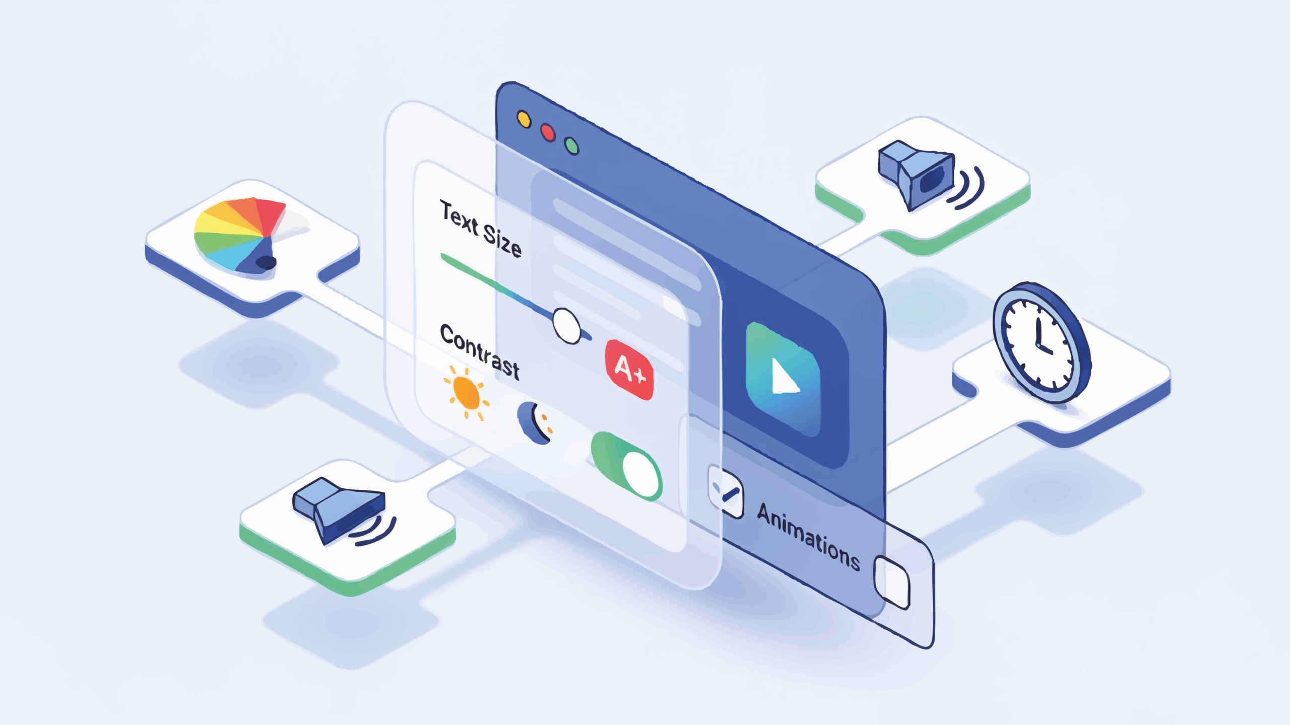
The Role of UX in Reducing Cognitive Load
Cognitive load refers to the mental effort required to process information. The higher the load, the more likely users are to disengage.
UX design exists to minimise this load.
Simple navigation, consistent patterns, readable layouts, and predictable interactions allow users to focus on the message rather than the mechanics of the site. When users don’t have to think about how to use a website, they can think about whether they want to proceed.
Every unnecessary choice, unclear label, or unexpected interaction adds friction. Over time, that friction accumulates into doubt.
Conversion happens when effort feels low and confidence feels high.
Why Visual Hierarchy Shapes Decisions
Visual hierarchy determines what users notice first, second, and third. It is how design communicates priority without words.
Headlines, subheadings, spacing, contrast, and alignment all influence where attention goes. If hierarchy is unclear, users don’t know what matters — and when nothing feels important, nothing is acted upon.
Effective hierarchy ensures that:
- key value propositions are seen immediately
- supporting information follows naturally
- calls to action stand out without aggression
- users always know where they are in the journey
Hierarchy is not about making things bigger or bolder for the sake of it. It is about guiding attention intentionally.
Trust Is Built Through Design, Not Just Copy
Many businesses assume trust is built through testimonials, accreditations, and case studies alone. While these help, trust is established much earlier — often before a visitor scrolls.
Design signals trust through:
- consistency and coherence
- professional execution
- attention to detail
- balance and restraint
- accessibility and usability
A website that feels disorganised, cluttered, or outdated raises red flags, regardless of how strong the copy may be.
Trust is emotional before it is rational. Design sets that emotional baseline.
Why “Pretty” Websites Still Fail
A website can be visually beautiful and still perform poorly. This often happens when design decisions are made in isolation from user intent.
Aesthetic design focuses on how the site looks. Decision-led design focuses on how the site works for the user.
When visuals dominate without purpose, users may admire the site but fail to understand it. Admiration does not equal action.
The most effective websites are not those that impress designers — they are the ones that make users feel confident, understood, and ready to act.
Designing for Momentum, Not Perfection
Many websites aim for perfection: the perfect layout, the perfect wording, the perfect visual experience. In doing so, they forget the real goal — momentum.
Momentum is created when users feel comfortable moving forward. This requires reassurance, not perfection.
Small signals accumulate:
- clear language
- predictable behaviour
- helpful prompts
- accessible information
- human tone
These signals reduce friction and encourage progression. Design should make the next step feel easy, not momentous.
Mobile UX Is About Decisions, Not Responsiveness
Mobile design is often treated as a technical challenge — ensuring layouts “work” on smaller screens. In reality, mobile UX is a behavioural challenge.
Mobile users are often distracted, time-poor, and goal-oriented. They are less tolerant of friction and less willing to explore.
Decision-led mobile design prioritises:
- immediate clarity
- concise messaging
- obvious actions
- fast load times
- minimal distractions
A mobile-friendly brochure is still a brochure. A mobile-first decision experience is something else entirely.
Why Navigation Is a Strategic Tool, Not a Menu
Navigation is one of the most powerful decision-shaping elements on a website, yet it is often treated as an afterthought.
Navigation tells users:
- how complex the business is
- what the business values most
- where they should start
- what options matter
Overloaded navigation creates uncertainty. Under-explained navigation creates confusion. Strategic navigation creates confidence.
If users don’t know where to go, they don’t go anywhere.
Calls to Action Are Design Elements, Not Sales Tools
Calls to action fail when they feel forced. They succeed when they feel like the natural next step.
Design plays a crucial role here. Placement, spacing, colour, and context all influence whether a CTA feels intrusive or helpful.
A decision-led website uses CTAs to support the user’s journey, not interrupt it. The best CTAs feel obvious in hindsight — because the design has done the work beforehand.
Websites as Ongoing Conversations
A brochure speaks at people. A decision-led website speaks with them.
Modern websites should feel like conversations — answering questions progressively, anticipating concerns, and adapting to different levels of readiness.
Not every visitor is ready to convert. Good design respects that by offering multiple paths forward without pressure.
When users feel understood rather than pushed, conversion becomes easier.
Measuring Success Beyond Aesthetics
Design success cannot be judged by appearance alone. A website’s true performance is reflected in behaviour:
- do users stay?
- do they scroll?
- do they explore?
- do they return?
- do they act with confidence?
Design that improves these behaviours is successful, regardless of trends or awards.
Final Thoughts: Design Is About Decisions, Not Decoration
Your website is not there to impress. It is there to help people decide.
Every design choice either removes friction or introduces it. Every layout either clarifies or confuses. Every interaction either builds confidence or undermines it.
In a digital landscape full of noise and distraction, the websites that perform best are not the most decorative — they are the most intentional.
When you design for decisions rather than decoration, your website stops being a brochure and starts becoming what it should have been all along: a tool for clarity, confidence, and action.


The Ultimate Social Media Guide
With the ever-growing power of social media, we use the latest techniques, video, and animation software to craft eye-catching social media assets that make your brand pop. Our designers, wielding Adobe Creative tools, create distinctive animations and graphics to illuminate your brand story and highlight your products or services. Want a unique design? No problem – we also offer bespoke designs to match your brand aesthetic.