News
Building a High-Converting Landing Page: Essentials You Can’t Ignore
In the digital marketing landscape, landing pages are often the unsung heroes. They are where first impressions are made, decisions are influenced, and conversions happen. While your homepage might introduce your brand and your blog might educate, your landing page exists for one reason and one reason only: to convert visitors into leads or customers.
But creating a high-converting landing page isn’t just about slapping together a few catchy headlines and a sign-up form. It’s a blend of psychology, design, copywriting, and user experience — all working in unison to guide your visitor toward a single, clear action. Whether you’re capturing emails, promoting a product, or driving registrations, the margin between a good landing page and a great one lies in the details.
In this article, we’ll explore the core principles behind high-converting landing pages, the essentials you simply can’t ignore, and why fine-tuning each element matters more than ever in today’s crowded online space.
The Purpose of a Landing Page
Before we dive into optimisation techniques, it’s important to clarify what a landing page is — and what it isn’t.
A landing page is a standalone web page created specifically for a marketing or advertising campaign. It’s where a visitor “lands” after clicking on a link from an email, ad, social media post, or another source. Unlike a homepage or a product page, a landing page has one focused goal — conversion.
This could be:
- Signing up for a newsletter
- Downloading a free resource
- Registering for a webinar
- Making a purchase
- Booking a consultation
The key here is focus. Everything on the page should drive toward a single objective, with no distractions or competing CTAs. It’s this clarity that sets landing pages apart — and why they’re so powerful when done right.
The Anatomy of a High-Converting Landing Page
There’s no one-size-fits-all formula, but successful landing pages typically include the following components, each playing a strategic role in persuading the visitor to take action:
1. A Compelling Headline
Your headline is the first thing people see — and often the only thing they’ll read before deciding whether to scroll down or click away. It needs to be clear, concise, and benefit-focused.
Rather than being clever or cryptic, a high-converting headline tells the visitor exactly what they’re getting and why it matters to them. It should speak directly to the problem your audience is facing or the outcome they desire.
A strong headline should:
- Grab attention immediately
- Clearly communicate value
- Be relevant to the ad or link that brought them there
For example, if your ad promises “Get More Leads with Less Effort,” your landing page headline should reflect that promise — perhaps something like “Automate Your Lead Generation in Just 7 Days.”
Consistency and relevance are key.
2. Supporting Subheadlines
If the headline pulls them in, the subheadline gives them a reason to stay. This section supports your main claim and provides a little more context. Think of it as your chance to elaborate on the promise made in your headline — what, how, or why.
It’s often placed directly beneath the headline, written in a slightly smaller font, and offers that little extra push to keep your visitor engaged.
3. Persuasive, Benefit-Driven Copy
This is where your messaging needs to shine. Good landing page copy is clear, concise, and always focused on benefits over features. Visitors don’t care about your process — they care about the outcome.
Use conversational language and aim to connect emotionally. Show that you understand the visitor’s pain points and offer a tangible, realistic solution.
Break your content into digestible chunks. Avoid large blocks of text. Instead of overloading your page with endless paragraphs, focus on highlighting the most critical points, ideally near the top of the page.
When it comes to tone, match your audience. A SaaS tool targeting enterprise users might use a more professional tone, while a fitness coach marketing a transformation programme can afford to be more casual and energetic.
The golden rule? Write as if you’re speaking directly to one person — because you are.
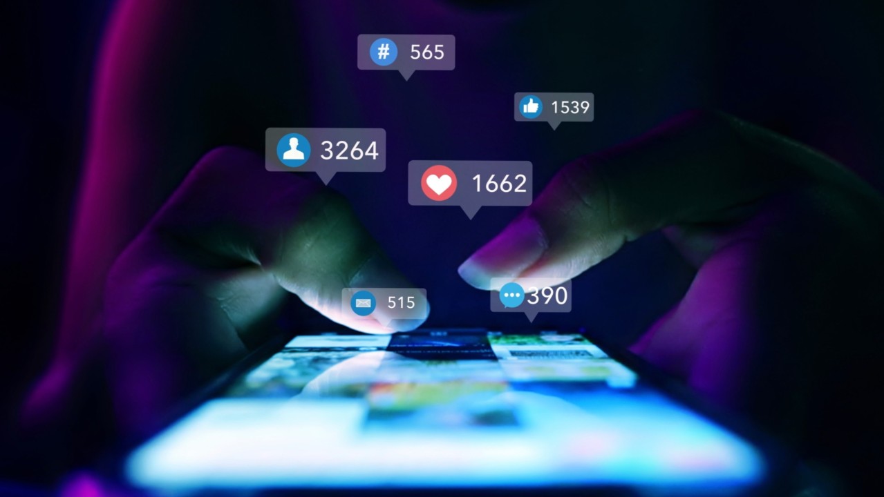
4. Social Proof That Builds Trust
One of the biggest barriers to conversion is doubt. Social proof — testimonials, case studies, trust badges, user-generated content, or media logos — can help remove that doubt and build credibility.
When visitors see that others have achieved results using your product or service, their confidence increases. That’s the power of social proof: it bridges the gap between curiosity and trust.
To make your testimonials more effective:
- Use real names and photos whenever possible
- Highlight specific results or outcomes
- Ensure they speak to common objections or pain points
For example, a vague “Great product!” doesn’t do much. But “I doubled my client enquiries in just three weeks using this landing page builder” tells a compelling story.
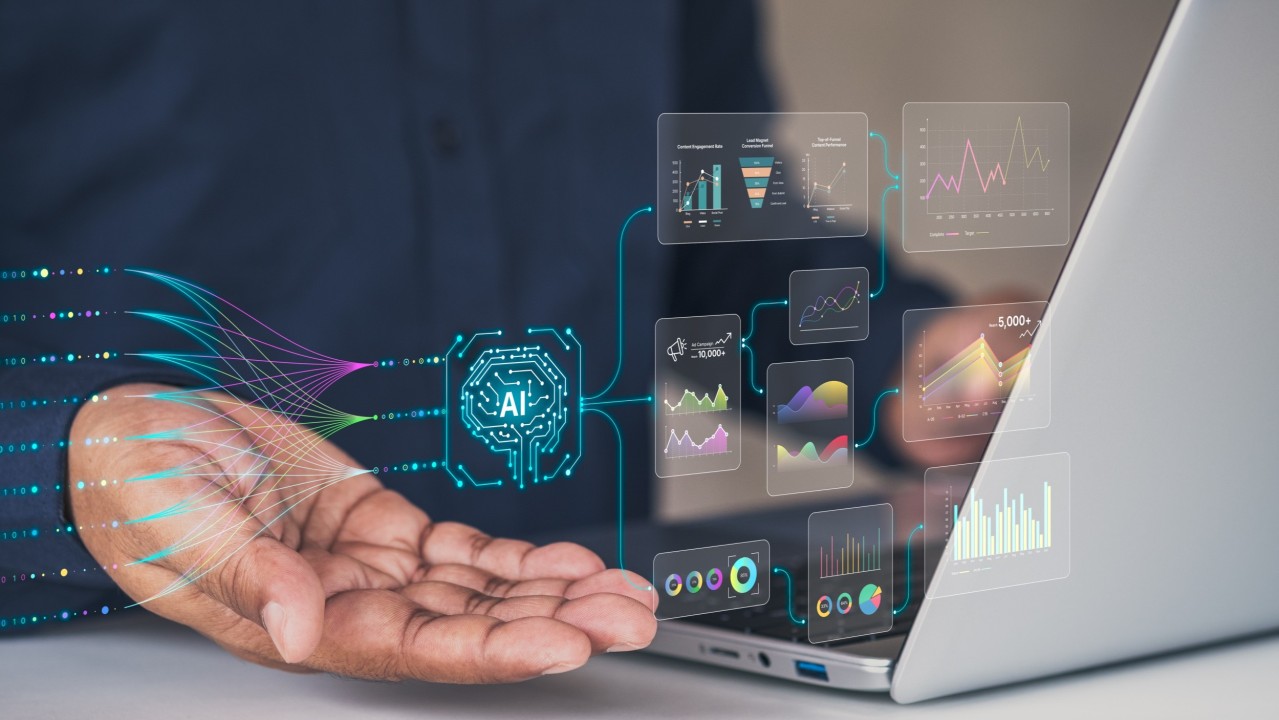
5. Eye-Catching Visuals and Media
Visuals aren’t just decorative. They play a vital role in communicating value quickly and guiding the user’s attention.
Whether it’s a product image, explainer video, mock-up, or a simple hero photo, visuals should support your message — not distract from it.
In many cases, a short video can significantly increase conversions. Videos give you the opportunity to explain your offer, demonstrate the product, and build a personal connection, all in under two minutes.
Just be sure to keep file sizes optimised and avoid auto-play with sound — that’s a surefire way to frustrate visitors.
6. A Single, Strong Call to Action
Your CTA (call to action) is arguably the most important element on the page. It’s the conversion point — the moment of truth.
A strong CTA should be:
- Visually distinct
- Action-oriented (e.g. “Start Your Free Trial” instead of “Submit”)
- Placed in multiple locations throughout the page
Avoid having more than one CTA on the same landing page unless they lead to the same outcome. Multiple choices create friction and confusion. The clearer the path, the more likely people are to follow it.
And always make sure your CTA button contrasts with the rest of the page, so it stands out without clashing.
User Experience: The Often-Ignored Conversion Factor
You could have all the right elements in place, but if your landing page is slow, cluttered, or poorly optimised for mobile, your conversions will suffer.
Speed, simplicity, and responsiveness are non-negotiables.
A high-converting landing page is:
- Fast-loading: Every second of delay increases bounce rates and reduces conversions.
- Mobile-first: The majority of users now browse on their phones. Your page must look and function perfectly on smaller screens.
- Visually clean: Remove unnecessary distractions, navigation bars, and links that take users away from your CTA.
- Well-structured: Use whitespace, headings, and visual hierarchy to guide the eye naturally through the page.
Test your landing page across devices and browsers. Something that looks great on desktop could break on mobile — and that’s often where most traffic comes from.
The Psychology of Conversion: Subtle Tweaks That Make a Big Difference
Design and copy are essential, but understanding the psychology behind user behaviour can take your landing page to the next level. Here are a few psychological principles that high-converting pages leverage:
Scarcity and Urgency
Adding a sense of urgency (“Offer ends tonight”) or scarcity (“Only 5 spots left”) can nudge users to act now instead of later. Just make sure it’s genuine — false urgency can backfire.
Anchoring
This is the principle of setting a reference point. For example, if you show a premium option at £199/month, then offer a “standard” version for £49/month, the latter suddenly feels like a bargain.
Consistency
Make sure the message in your ads, social posts, or emails aligns with the messaging on your landing page. Any disconnect can create confusion and reduce trust.
Loss Aversion
People are often more motivated to avoid loss than to achieve gain. Instead of just saying, “Get more leads,” you might frame it as, “Stop losing leads to your competitors.”
These tweaks might seem subtle, but they can have a profound effect on behaviour.
Testing and Optimisation: It’s Never ‘One and Done’
Even a beautifully designed, copy-rich landing page isn’t guaranteed to perform perfectly out of the gate. Testing is where real improvements happen.
A/B testing (or split testing) allows you to compare two versions of your landing page to see which one converts better. You might test:
- Headlines
- CTA button text or colour
- Images or videos
- Layout and design elements
- Form length or fields
Sometimes, the smallest changes yield the biggest results.
Also, monitor behaviour using tools like heatmaps or session replays. These insights can reveal where users are clicking, where they drop off, and what’s causing friction.
Optimisation isn’t a one-time event. It’s a continuous process of learning, iterating, and improving.
Don’t Forget the Thank You Page
Once someone converts, the journey doesn’t end. A well-designed thank you page is an opportunity to deepen engagement.
You can:
- Confirm the action they just took
- Offer a next step (e.g. “Join our community” or “Download your guide”)
- Cross-promote other relevant content
- Reinforce brand value
It’s also a good place to place a tracking pixel to measure conversions properly.
Many brands underestimate the thank you page. Don’t make that mistake. It’s part of the conversion journey and can help drive further actions if used wisely.
The Sum of the Parts
A high-converting landing page is more than just the sum of its parts. It’s the result of understanding your audience deeply, aligning your message with their needs, and delivering it in a frictionless, persuasive way.
There’s no magic bullet, but there are clear best practices that, when followed with attention and intention, dramatically increase your chances of success.
Landing pages are no longer optional — they are essential. Whether you’re running PPC campaigns, launching a new product, or building your email list, your landing page is often your first and best chance to turn interest into action.
So give it the time, attention, and testing it deserves. Because when done right, a landing page doesn’t just convert — it converts consistently.


The Ultimate Social Media Guide
With the ever-growing power of social media, we use the latest techniques, video, and animation software to craft eye-catching social media assets that make your brand pop. Our designers, wielding Adobe Creative tools, create distinctive animations and graphics to illuminate your brand story and highlight your products or services. Want a unique design? No problem – we also offer bespoke designs to match your brand aesthetic.