News
Why Most Business Websites Fail to Convert Visitors Into Enquiries
Understanding the hidden problems that prevent websites from turning traffic into leads — and what businesses should do instead
Many business websites look impressive.
They feature modern layouts, professional branding, polished imagery, and carefully written copy. Yet despite all of this effort, a large number of websites still fail at the one thing that matters most:
Generating enquiries.
Traffic may arrive through SEO, paid advertising, social media, or email campaigns, but visitors leave without taking action. Contact forms remain unused, calls-to-action are ignored, and potential customers disappear before meaningful engagement ever begins.
This is one of the most common problems in digital marketing.
And in most cases, the issue is not visibility — it is conversion.
The reality is that many websites are designed to look good rather than function strategically. They prioritise aesthetics over clarity, information over persuasion, and complexity over usability.
In 2026, successful websites are no longer digital brochures. They are structured systems designed to guide users toward decisions.
The Disconnect Between Traffic and Conversion
Businesses often focus heavily on driving traffic to their website.
SEO campaigns target rankings. Paid advertising increases clicks. Social media expands reach. While these activities are important, they only solve the first part of the problem.
Traffic alone has no value if visitors do not convert.
This is where many websites break down. They attract users successfully but fail to create a clear pathway from interest to action. Visitors arrive with intent, but the website does not help them progress confidently toward an enquiry.
The result is friction, hesitation, and abandonment.
A website’s effectiveness should therefore not be measured primarily by how many people visit it, but by how effectively it moves those people toward meaningful outcomes.
Clarity Is More Important Than Creativity
One of the biggest mistakes businesses make is prioritising creativity over clarity.
In an attempt to appear modern or distinctive, websites often become overly abstract. Headlines are vague, messaging lacks focus, and users are forced to work too hard to understand what the business actually does.
Visitors do not want to solve puzzles.
When someone lands on a website, they are subconsciously asking a series of simple questions:
- What does this business do?
- Is it relevant to my needs?
- Can I trust them?
- What should I do next?
If those questions are not answered quickly and clearly, attention is lost.
Strong design matters, but clarity matters more. The most effective websites communicate value immediately and remove unnecessary cognitive effort from the user journey.
Too Much Information, Not Enough Direction
Another common issue is information overload.
Many websites attempt to communicate everything at once. They include excessive text, too many services, multiple competing messages, and countless calls-to-action scattered throughout the page.
Instead of guiding users, this creates confusion.
Effective websites understand that conversion depends on direction. Every page should have a clear purpose and a logical progression. Content should guide visitors naturally from understanding to trust, and from trust to action.
This does not mean simplifying content excessively. Depth and detail remain important. However, information must be organised strategically so users can absorb it without feeling overwhelmed.
Good websites do not merely present information — they shape decisions.
Weak Messaging Creates Weak Conversion
Many websites fail because their messaging lacks specificity.
Generic phrases such as “high-quality service” or “tailored solutions” appear everywhere online. They sound professional, but they communicate very little.
Users are looking for relevance.
They want to understand:
- who the business helps
- what problems it solves
- how it delivers value
- why it is different from alternatives
Without clear positioning, websites become forgettable.
Strong conversion-focused messaging is specific, direct, and audience-centred. It reflects real customer needs and demonstrates understanding rather than relying on vague marketing language.
The Problem with Designing for the Business Instead of the User
Many websites are designed around internal priorities rather than user behaviour.
Businesses structure navigation based on departments, services, or company terminology that makes sense internally but not necessarily to visitors. Pages are written from the company’s perspective rather than the customer’s perspective.
This creates disconnect.
Users do not care about internal structures. They care about solving problems and finding relevant information quickly.
Websites that convert successfully are built around user intent. They anticipate questions, remove uncertainty, and guide visitors naturally through the decision-making process.
The best-performing websites are not business-centric. They are user-centric.
Why Trust Signals Matter More Than Ever
Trust is one of the biggest factors influencing conversion.
Before submitting an enquiry, users look for reassurance that a business is credible, capable, and reliable. If trust signals are weak or absent, hesitation increases.
Trust is communicated through multiple elements, including:
- case studies and testimonials
- clear explanations of expertise
- consistent branding and messaging
- professional design and usability
- visible contact information and social proof
However, trust is also shaped by subtler factors.
A slow website, unclear messaging, or confusing navigation can reduce credibility instantly. Users often judge professionalism based on the overall experience rather than any single element.
Conversion depends not only on what a website says, but on how confidently it says it.
Poor User Experience Creates Friction
Friction is one of the biggest enemies of conversion.
Every unnecessary obstacle increases the likelihood that users will leave without taking action. This friction may take many forms:
- slow page loading
- confusing navigation
- overly complex forms
- poor mobile usability
- unclear calls-to-action
Many businesses underestimate how quickly users abandon frustrating experiences.
Modern websites must feel intuitive. Users should never have to think too hard about where to click, how to navigate, or what to do next.
The smoother the journey, the higher the likelihood of conversion.
Mobile Experience Is No Longer Secondary
A significant proportion of website traffic now comes from mobile devices, yet many business websites are still designed primarily for desktop experiences.
This creates problems.
Content that looks clean and structured on desktop may feel cluttered and difficult to navigate on smaller screens. Calls-to-action may be poorly positioned, forms may be frustrating to complete, and page speed may suffer.
Mobile optimisation is no longer a technical enhancement — it is fundamental to usability.
Businesses that fail to prioritise mobile experience risk losing large volumes of potential enquiries before users even engage properly with the content.
Why Calls-to-Action Often Fail
Calls-to-action are supposed to guide users toward the next step.
However, many websites either hide them, overuse them, or fail to make them compelling.
A strong call-to-action provides clarity and confidence. It should feel like a logical continuation of the user journey rather than an abrupt sales prompt.
Importantly, calls-to-action should align with user intent.
Not every visitor is ready to buy immediately. Some may need more information, reassurance, or lower-commitment actions before progressing further.
Websites that recognise this create layered conversion pathways rather than relying on aggressive selling.
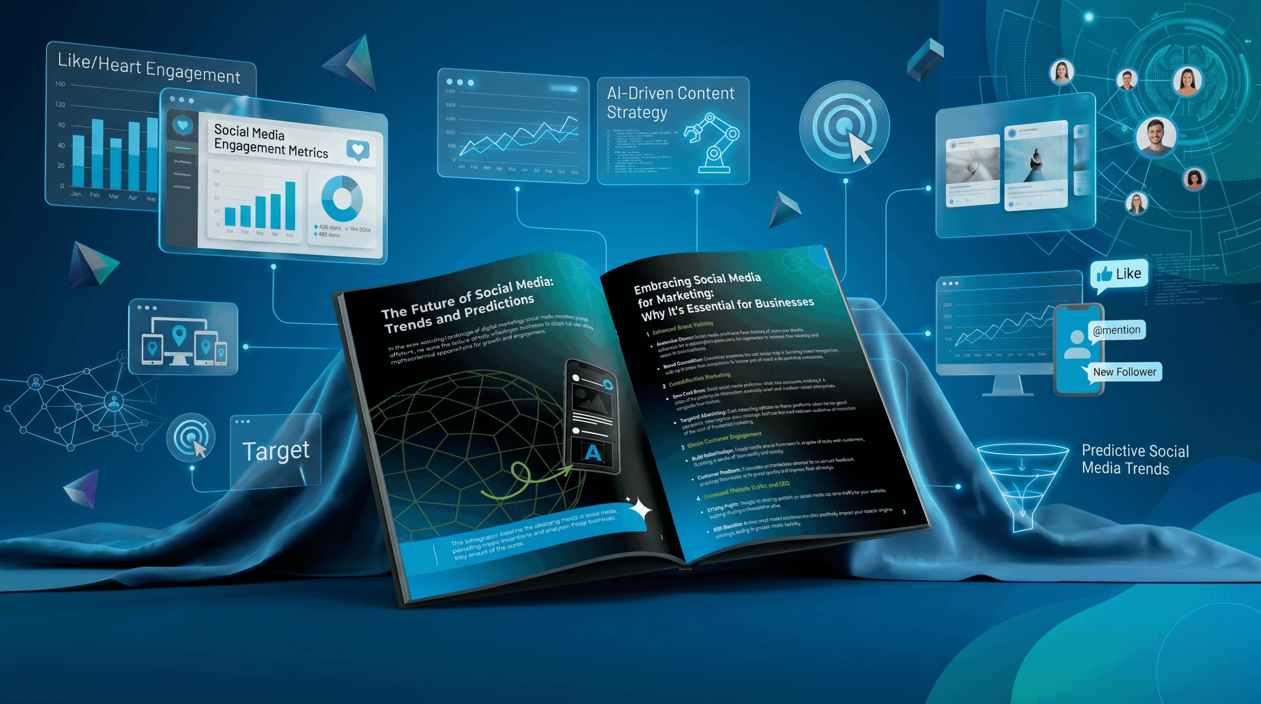
The Growing Role of AI and Behavioural Insights
Modern conversion optimisation is increasingly driven by data and AI-powered insights.
Businesses now have access to tools that reveal:
- where users disengage
- which content drives action
- how visitors navigate through pages
- what elements create friction
These insights allow websites to evolve continuously based on real behaviour rather than assumptions.
The most effective websites are not static. They are refined constantly to improve clarity, usability, and conversion performance.
Conversion Is a Strategic Process, Not a Design Feature
Many businesses treat conversion as a design issue.
In reality, conversion is the result of alignment between multiple factors:
When these elements work together, websites become significantly more effective.
When they conflict, performance declines — regardless of how visually appealing the site may be.
Websites Should Guide Decisions
A website should do more than exist online.
It should actively help users move from uncertainty to confidence, and from interest to action.
Most business websites fail to convert because they focus too heavily on appearance and not enough on guidance. They present information but fail to structure experiences that support decision-making.
The businesses that succeed online are those that understand a simple principle:
Websites are not digital brochures. They are decision-making environments.
And the websites that generate the most enquiries are the ones designed to make decisions easier.